Note: This post has been updated to reflect the new publishing flow in Haiku Deck 2.0, which affects how you view your deck online to create Notes. If you haven’t updated your app, please be sure to do that here.
As a Haiku Deck user, you’re already on the leading edge of awesomeness. But we all know there’s always a way to be thatmuchmore awesome, so we want to be sure you know about a quick way to take your Haiku Decks to the next level of awesome: add Notes to the web view of your deck.
If you’ve ever felt like you can’t quite fit what you want to say on a Haiku Deck slide, or if you’d like to try a ridiculously easy way to incorporate best practices into your presentations, trust us–you will love this.
3 Reasons to Add Notes to Your Haiku Deck
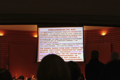
1. Add Helpful Detail: Haiku Deck focuses your message by limiting the text on each slide, but if more detail or supplemental resources would add value, Notes gives you a place to do it. Here’s an example of a great Haiku Deck made exponentially more awesome with Notes (props to Bill Risser of Phoenix):
Click to view the full Haiku Deck with Notes (and pick up some great Facebook tips, too)
Over the past few weeks we’ve enjoyed collaborating with Nolan Haims, VP and Presentation Director at Edelman and author of the excellent blog Present Your Story, a fantastic resource for presentation inspiration and best practices. Nolan has been keeping us on our toes to make sure we’re not unleashing the wrong kind of zen presentation style into the world. We are grateful.
Q&A with Nolan Haims
Haiku Deck: What’s your presentation design philosophy in a nutshell? (Or, for super bonus extra credit, in a haiku?)
Nolan:
Design content
Not just frames
Around that content
[Haiku Deck note: This is technically more of a lune. But if we’ve learned anything from Nolan, it’s that there’s always a way to further simplify. Why have 17 syllables when 12 will suffice?]
Back to Nolan: The majority of presentation design continues to be focused on templates and unintegrated elements like clipart and random rectangles of imagery thrown on slides. Presentation design is too often thought of as template design, but a heavily designed template is just a frame around your actual message. I would love to see more people spend their energies and talents laying out and designing content, focusing on information design and a visual communication of the actual messages on a slide by slide basis.
Haiku Deck: What most makes you cringe in a poorly designed presentation?
Nolan: Too much content in on-screen presentations. Simply stated: the more that is on your slide, the less your audience will absorb—or even read in the first place. Studies have shown that students learn more when presented with less. It should be the same for presenters’ audiences. This means ruthless editing and often separate, more detailed print documents. Both of these things take time, which is why I think most people simply avoid them.
But, know when your presentation is actually a print document. There’s nothing wrong with creating a detailed textual document using PowerPoint—just know the difference between that and an on-screen presentation.
Haiku Deck: It’s not every presentation expert that recommends making your presentation like a Twinkie. Could you elaborate on that a bit?
Nolan: Oh, the Twinkie bit! When I train and coach, I tell people that they should have only two goals when creating presentations: 1) clarity and 2) stickiness. It doesn’t matter how brilliant you or your message is, if an audience doesn’t clearly understand your message and then remember it, your efforts are all for naught.
Much of presentation design is rightfully focused on the clarity part, but when it comes to stickiness, the most effective way to get your audience to remember your messages is to wrap them in stories. Charts, graphs, text, and pictures don’t last. Stories can live forever.
So, think of an idea as a Twinkie’s filling: on its own, it might be delicious, but it’s hard to digest, and it won’t last. But wrap that idea in a delicious cake wrapper—a story—and it will last forever. Just like a Twinkie…
A fantastic book on the stickiness of stories is Chip and Dan Heath’s Made to Stick.
Haiku Deck: What’s the best presentation you’ve ever seen, and what did you love about it?
Nolan: I love Don Draper’s Kodak Carousel pitch from Season 1 of Mad Men. He makes use of many techniques that business presenters are hesitant to employ, but would be smart to incorporate:
Brevity: The pitch lasts just a few minutes.
Emotion: A good presentation should be a healthy mix of the analytical and emotional. While Don’s almost 100% emotional presentation style is probably too much for most non-fictional presenters, I think most presentations would be aided by more emotion.
The Personal: Every picture is a personal one of Don’s family—no stock handshakes, no guys climbing mountains; as with the emotional, most presentations would benefit from more personal touches.
Stories: Don tells a personal, visual story of his own life; it not only leaves his audience literally speechless, but will no doubt be remembered for years—only a story can do that.
Limited Text: “Kodak Introduces Carousel” is the only text on screen…
Haiku Deck: What advice do you have for Haiku Deck users who want to create strong presentations?
Nolan: Well, you could create a great Don Draper-like presentation with it, for sure. I think that Haiku Deck can be a good tool for creating a highly distilled presentation and in many ways keeping the focus on the presenter rather than the slides. Slides should always just be the backup singers—the presenter should be main attraction. But avoid the temptation of randomness and incessant metaphor in choosing imagery. If you’re selling widgets, but all your audience remembers are pictures of lemonade stands, handshakes and relay races (“teamwork!”), you haven’t created anything very sticky. Consider literal imagery when possible: How about a picture of your widget’s manufacturing process instead of one of a Swiss watchmaker?
More Presentation Inspiration
For more presentation inspiration, be sure to take a spin through our Presentation Pointers Pinterest board and our Featured and Popular Galleries, which highlight new awesome examples every week. You can also access the Gallery any time, right from the app.
Last week we noticed a Twitter comment from Joby Blume, managing consultant at Bright Carbon, that Haiku Deck could encourage the selection of “near random” imagery that might ultimately weaken presentations. We invited him to elaborate on the topic in this guest post, and he graciously shared his expertise and insights.
Haiku Deck: What’s your philosophy on presentation design, in a nutshell?
Joby: Well, first of all it’s important to note that a presentation is more than just the slides – a presentation also needs a presenter. People seem to forget this basic point – slides can be put on SlideShare, or emailed – but without narration that’s not the whole presentation, it’s just the slides. The best way to design slides for SlideShare isn’t the same as the best way to create slides to actually use in a presentation.
A presentation needs to make the most of the interplay between slides and presenter. If the slides are self-explanatory, then the presenter gets ignored while the audience just read for themselves. If the slides aren’t relevant or helpful, then the presenter ends up giving a speech, not a presentation. There needs to be a balance – slides should help audiences to understand what’s being said, without making the presenter unnecessary.
Haiku Deck: What most makes you cringe in a poorly designed presentation?
Joby: There are levels of poor presentation design. Most slides are awful – full of text, often in font sizes that can’t even be seen by the audience. That’s the bottom level of awful. People who just never even thought about what they are doing too much, and used PowerPoint to type – just because they can.
Not like this. (Creative Commons licensed image by Oran Viriyincy)
Quite a lot of people are starting to understand that bullet-points don’t work, and are moving away from text-heavy slides. But what people do instead doesn’t always work either. It isn’t enough to stop using bullet points and assume that every slide you create will be awesome.
I saw a slide yesterday with six separate diagrams on. It looked professional in the sense that I think a graphic designer had created it, but they hadn’t thought about the unique medium of presentations. I think the logic of cramming things together was to try to keep the number of slides down, but it’s better to have more slides and present them faster. Where was the audience meant to look when shown six diagrams at once? The slide was un-presentable, even though it wasn’t text heavy at all. Slides don’t just need images – they need the right images.
Haiku Deck:You mentioned that the increasingly popular “zen” presentation style can lead to some pitfalls. Could you elaborate on that a bit?
Joby: When Steve Jobs stood up to launch the iPhone or iPad, he could show beautiful images of the products behind him on stage. These product shots were relevant – they were photos of what he was selling. And of course Steve jobs didn’t need a lot of support from his slides – he would have been confident standing up on stage and giving a speech anyway.
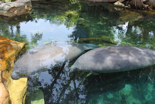
For the rest of us, things aren’t as simple as that. We can’t show product shots if we aren’t talking about products. We might not feel comfortable giving a speech. We sometimes need our slides to help us get the point across, but we can’t do that if we put up a beautiful picture of a snow-capped mountain when we are talking about complex derivatives. It’s the manatee problem – where slides look like they have been created almost at random with pretty photos and buzzwords that are too far removed from the actual message.
Ooo, pretty. (Creative Commons licensed image by JessieHarrell)
Joby: If you are giving a zen style presentation, using Haiku Deck or “the hard way,” ask yourself two questions:
Does this image actually help the audience to understand what I’m saying?
Would this image need to change if I was saying the exact opposite of what I’m trying to say?
If the answer to either question is “no,” then think about finding a more relevant image. Your slides need to be more than decoration. Don’t be scared to find or make some images of your own – create a chart, or sketch a diagram. Sometimes that’s the best way to explain your message. You can still use your own images in Haiku Deck – don’t worry!
Haiku Deck: What’s the best presentation you’ve ever seen, and what did you love about it?
Joby: For a conference-style presentation (on stage, with a large audience), perhaps Dick Hardt’s Identity 2.0 talk:
The slides aren’t beautiful, but they support the message, and presenter and slides work in perfect harmony. There’s an incredible number of slides – but they only show for a second or two each. It works.
The best presentation I’ve seen to a small group was really more like a visual conversation, with a lot of interactivity and back-and-forth. Seeing my colleague Richard having a visual sales conversation while using an iPad is pretty awesome.
Photo by andrechinn
We totally love showing people Haiku Deck for the first time, and seeing their reactions. They are almost always wowed by the amazing images and beautiful layouts. One thing we hear occasionally, though, is “It’s so cool! But how can I fit all my text on just those two lines?”
Guess what? If you can’t fit your text on two lines, you have too much text.
That’s right. Forget all the times you’ve crammed a document’s worth of ideas onto a single slide using 12-point bullets. That’s way too much for any audience to absorb. (And you’ve been in that audience before too, right?)
It sounds radical, but it can be radically freeing, as well. Try it! And if you need a slide makeover, give us a shout in the comments. We’re here to help set your story free.